Logo Design for a LOA Coaching Firm
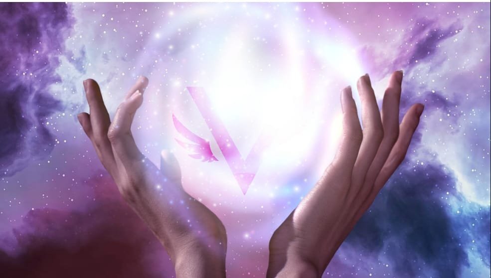
Our client wanted a distinct, symbolic logo that would represent her Law of Attraction (LOA) coaching business and her personal brand. The requirements were ambitious, aiming for a balance between intricate design elements and a scalable format suitable for various applications.

The Challenge
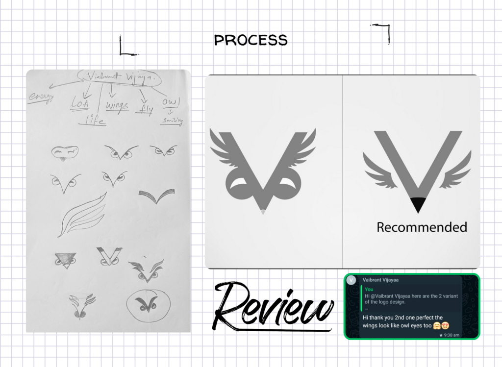
The client’s specifications for the logo were both creative and challenging. She requested a logo centered on the letter “V” that would symbolize energy, divinity, and a connection to the LOA community. To further personalize the logo, she wanted elements inspired by an owl and an eagle: incorporating eagle-like wings for a sense of strength and owl-like eyes or beak for wisdom and intuition. Creating a cohesive design that blended these unique symbols while ensuring scalability across different media was the primary design challenge.

Design Process
Our team of designers engaged in a series of brainstorming sessions to align our creative ideas with the client’s vision. We explored various themes and visual metaphors to bring out the sense of divinity, energy, and connection to the LOA community that she desired. The main challenge was to capture the essence of the owl and eagle elements—features that are often complex and detailed—while keeping the logo versatile and adaptable. After multiple sketches and mockups, we refined our concepts to ensure they resonated with the client’s vision and would be practical across a range of digital and print formats.
Services Used:
- Logo Desing, Graphic design
Final Logo Approval
The client approved a final logo sketch that skillfully merged all her desired elements, achieving the vision of a unique brand identity for her LOA coaching firm. To provide a complete branding package, we delivered the logo with a full presentation and a detailed logo style guide that outlined the logo’s colors, usage, and variations for different applications.
As part of our commitment to quality, we made additional geometric adjustments to the final design, refining proportions and alignment to create a polished, professional look. The final logo was crafted to reflect not only the client’s persona but also the brand’s mission and vision, offering a design that would resonate strongly with her audience.
- Logo Design and Branding
- Visual Identity Development
- Scalable Design Solutions
- Brand Presentation and Style Guide
Words from our client
“The logo was beyond my expectation, pretty impressive” Vijaya Menon


